Pop Markets


Pop Markets is a social networking app which aims to connect artists, attendees, and art market venues together. Pop Markets strives to create a sense of community and cultivate a “word of mouth” environment. Since no other app like Pop Markets currently exists, we hoped to innovate on similar platforms and create an interface that is both delightful and simple to understand.
Sole Product Designer; user research, design, prototyping, end-to-end product design
My Role
Brooklyn, New York
Where
August 2021 - November 2021
Timeline
Figma, Useberry, UserTesting.com, Miro
Tools
The Problem
Being a niche community, both artists and art enthusiasts often struggle to find nearby art markets that suit their needs and/or styles. These people will spend a frustratingly long time scouring the web find markets, only to come up empty-handed.
The Goal
Create a centralized application for artists, market attendees, and venue hosts alike to connect and find markets that suit their wants and needs.
The Design Process


I began by creating a research plan laying out objectives, scope, participant preferences, and methodology. My conducted research revealed valuable qualitative and quantitative insights, enabling me to easier empathize with users, allowing me to understand user objectives and pain points.
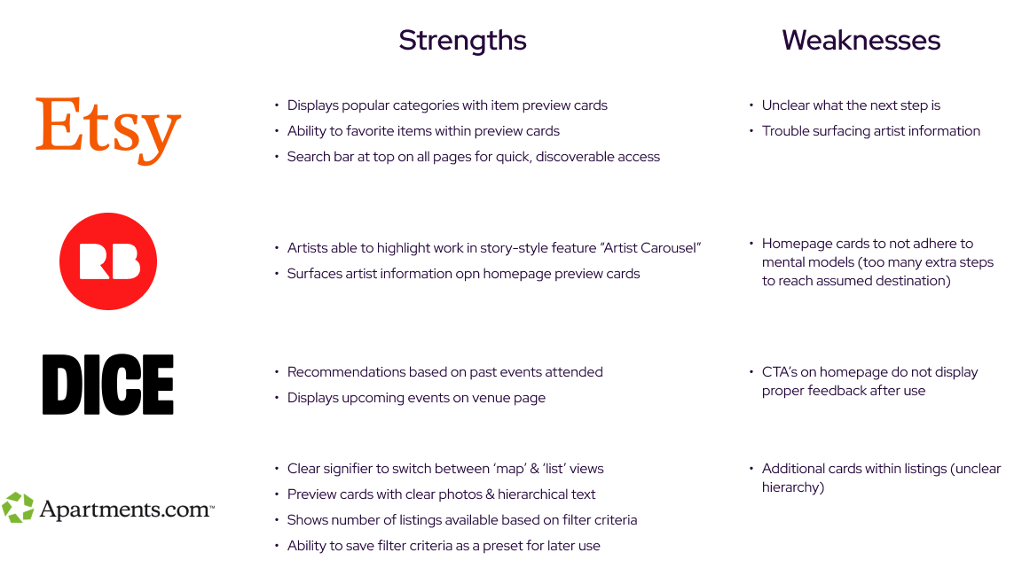
Comparative Analysis
Because Pop Markets is such a niche product, there weren’t many competitors to work with. Because of this, I decided to conduct comparative analysis rather than competitive. The four businesses I found attempting to solve similar or adjacent problems were Etsy, RedBubble, DICE, and Apartments.com.
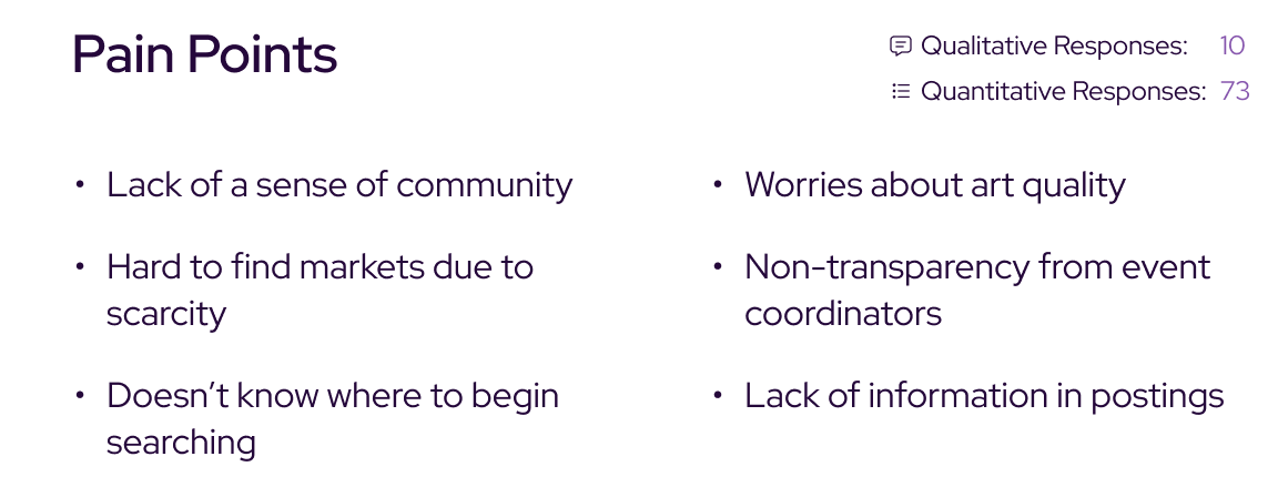
User Interviews & Surveys
Using what I had learned during my comparative analysis, I crafted a cohesive and comprehensive list of in-depth, open-ended interview and survey questions, again, all included in my research plan. These interviews and surveys revealed a few key user pain points, further expanding my understanding of user needs.
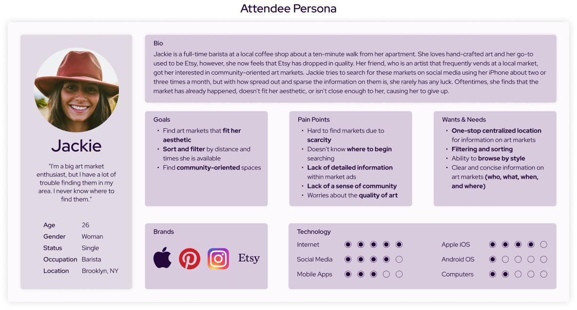
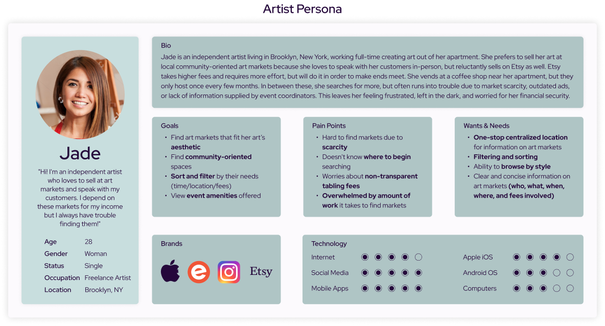
Empathy Mapping & User Personas
After my initial research, I conducted one-on-one user interviews and sent out surveys with people whom passed my screener. Many of the responses and insights gathered contradicted my initial assumptions, allowing me to better empathize and create user personas for the product.

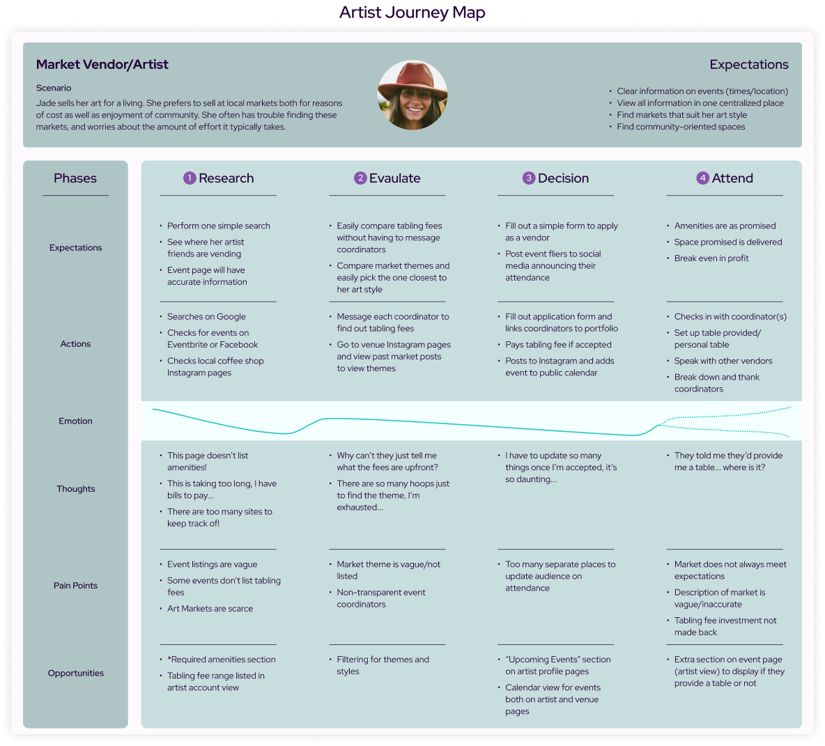
User Journey Maps
At this point I felt I had every piece I needed to properly empathize with Pop’s user-base. Using this information, I created a user journey map for each persona in order to aid in guiding future design decisions.

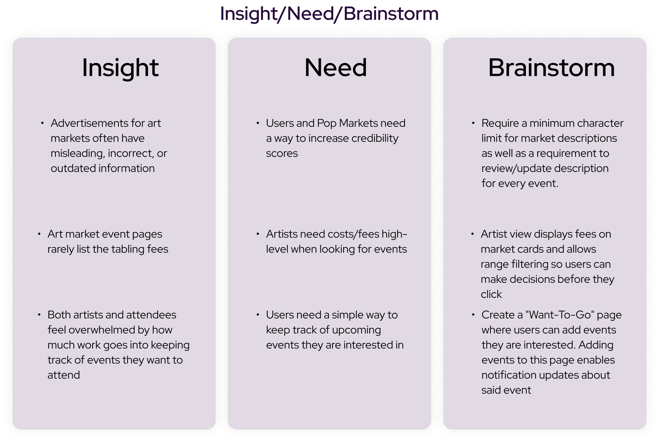
From comparative analysis to user journeys, the discover phase helped me easily immerse myself within the problem space, opening my eyes to many potential solution opportunities, as well as a few pitfalls to avoid. All of these exercises assisted in further empathy-building with our users, leaving me with a few valuable insights:
Both personas prefer community-oriented spaces
Both personas need artist & art style/genre information high-level
Users need to reach desired destinations within 3 steps in order to lower cognitive load

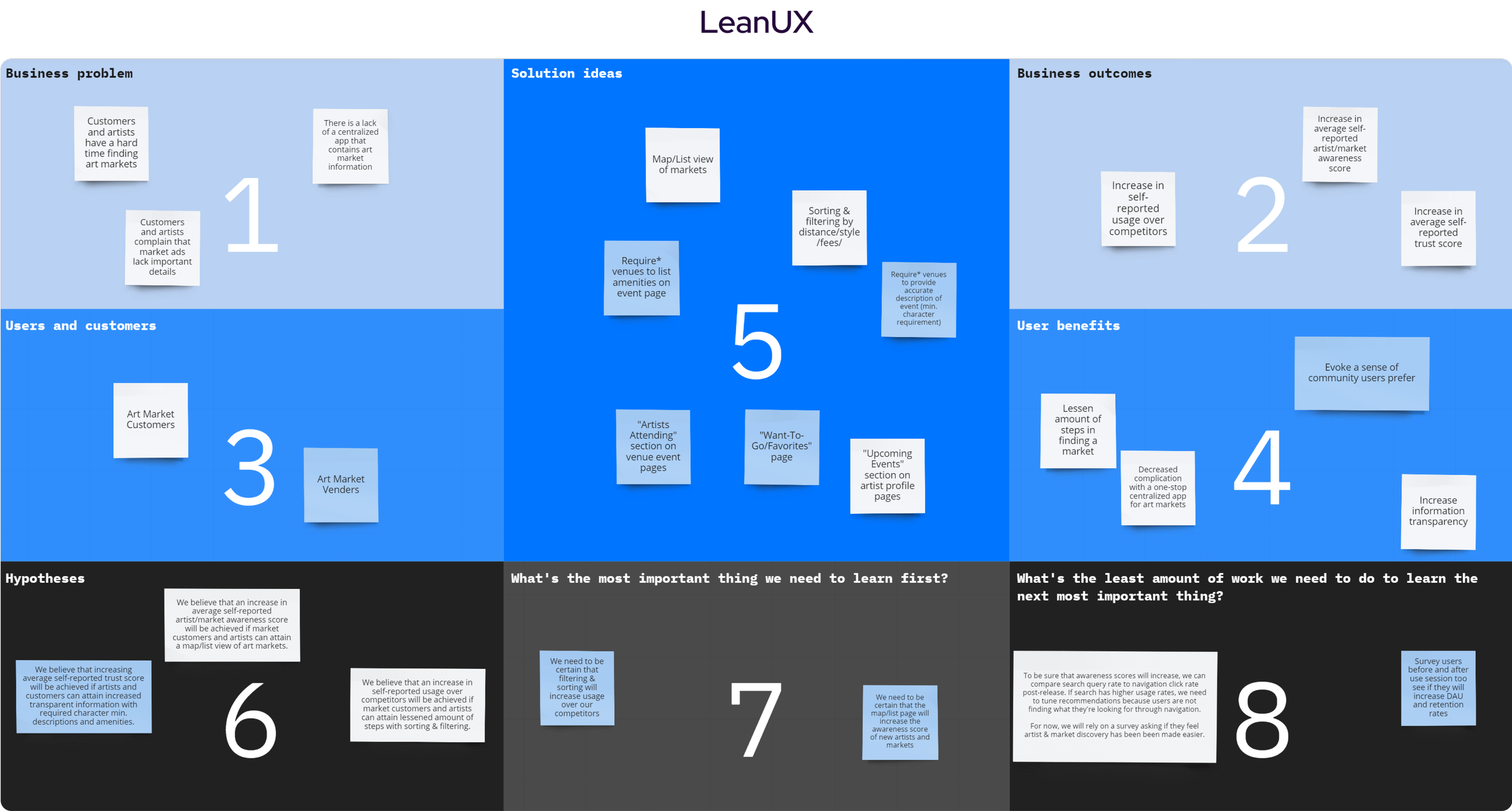
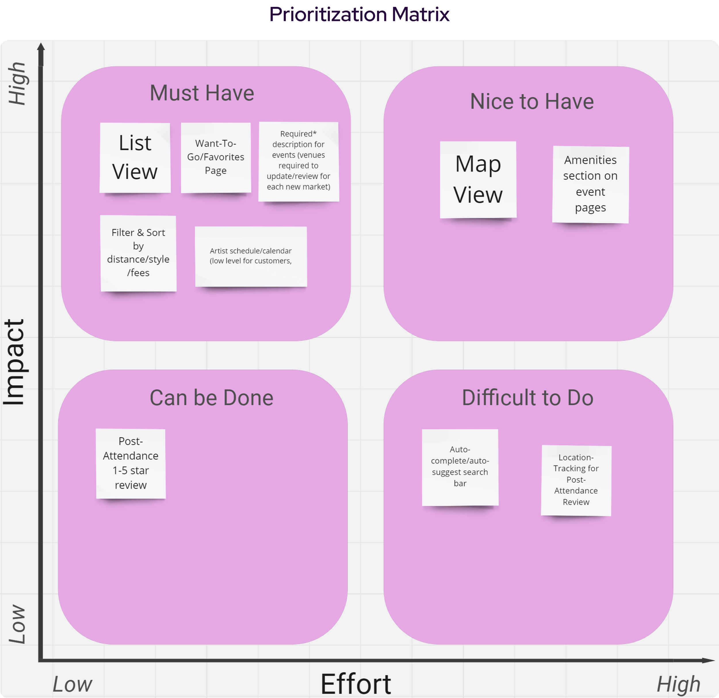
LeanUX, Insight/Need/Brainstorm, & Prioritization Matrix
After evaluating my data gathered, I picked out what I believed to be the most valuable insights, converted them into problems, and mapped them in a LeanUX board. From there, I determined a need to each, which allowed me to brainstorm a few potential solutions. I then used a prioritization matrix to ascertain which of these solutions should be made into features, and which should be put off.
Information Architecture
With the prioritized features from the prioritization matrix, I nested them within two IA flows; one for the artist end, and one for the attendee end of the app.
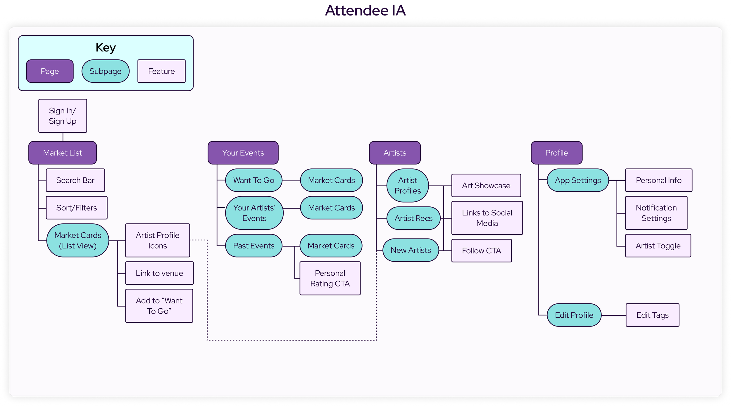


The strategize phase did much work assisting me in organizing my thoughts and ideas, mapping them out logistically and holistically. These exercises resulted in the ideation and creation of many features which made it into the final design.

Sketching
Carefully following the IA roadmap, I sketched out my ideas in order to lay out the app’s basic structure. This allowed me to better visualize user flows, thus informing future design decisions.

Mid-Fidelity Wireframes
Once I was happy with my basic screen sketches, I began designing mid-fidelity wireframes and prototypes. After prototyping, I designed a few usability tests for each end of the app using Useberry and sent them out to select participants who passed my screener.

Mid-Fi Usability Testing
Once I was happy with my basic screen sketches, I began designing mid-fidelity wireframes and prototypes. After prototyping, I designed a few usability tests for each end of the app using Useberry and sent them out to select participants who passed my screener.
Findings
Users often were confused by unclear iconography
Users would often have trouble finding “save event” button, increasing bounce rate
Artists had trouble finding their calendar
Artist participants expressed a desire to add descriptions to gallery images
Users expressed a desire for a method of increasing trust in venues
Solutions
Updated iconography to better reflect purpose and conventions
Add a save feature to Posters themselves as well as a first time tooltip on market pages
Add microcopy “Your Calendar” above calendar
Add affordance of adding an image description as well as a way to edit later
Add an affordance for verified artists to be able to submit public ratings and reviews post-event
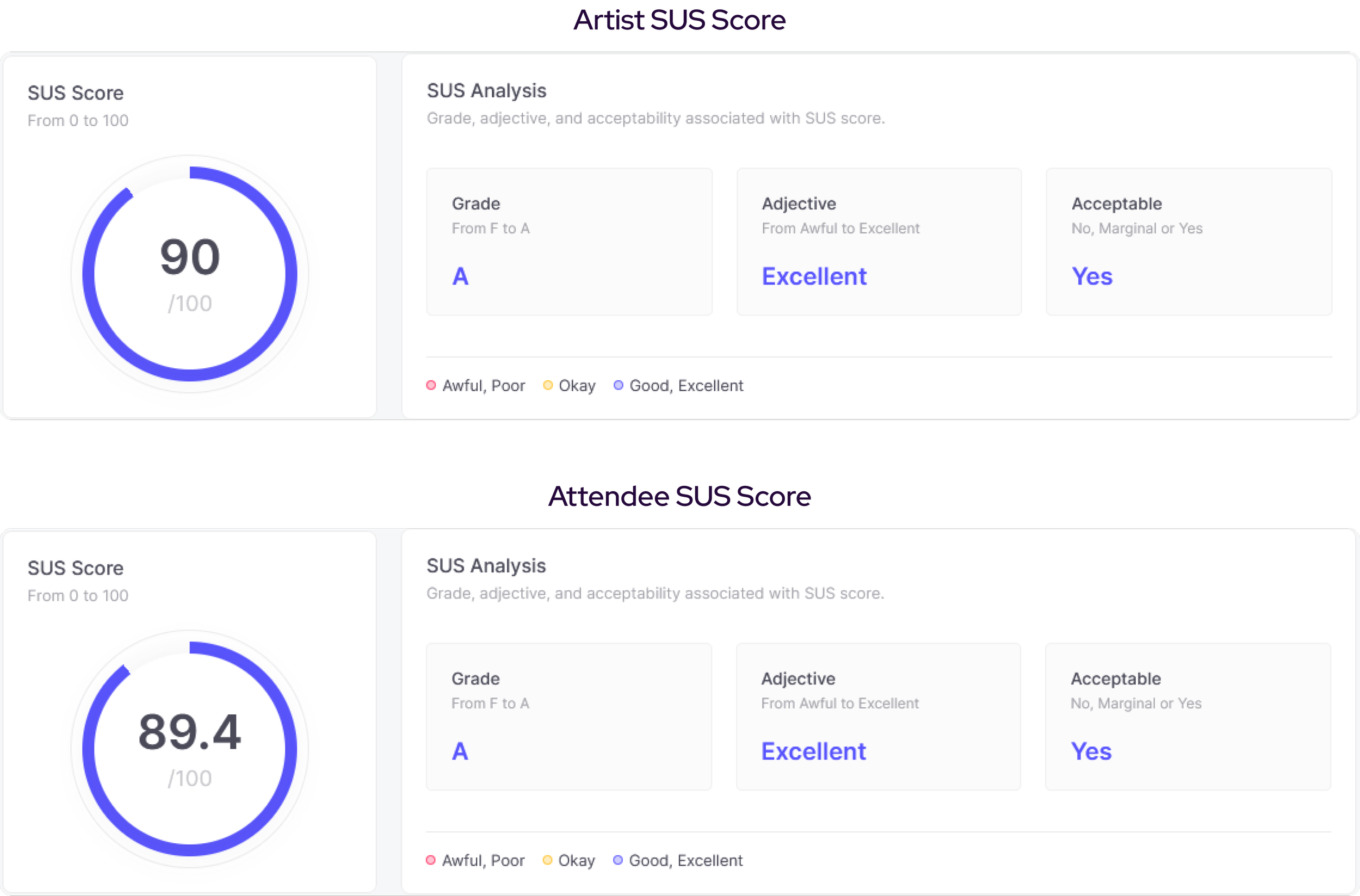
With an average time-on-task at 28.6 seconds, a 100% completion rate, and a SUS score 90 for artists and of an average time-on-task at 29.7 seconds, an 89% completion rate, and a SUS score of 89.4 for attendees, I felt I had everything I needed to move on to the next step in my process.
Design System
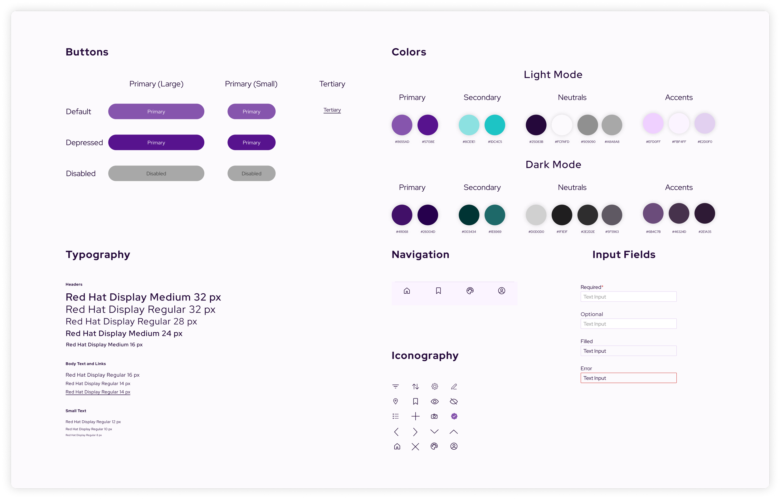
For visual design, I created a simple but comprehensive design system. Following three core principles (Relaxation, Community, & Understandability), I created components, pattern usage guidelines, and style guides with examples and application conventions. I meticulously documented this system, which can be viewed here. For simplicity’s sake, I’ve documented a summarized UI kit as shown below.

The design phase allowed me to further explore my ideas and workflows in a visual and more tangible way. I was able to identify points of friction which resulted in tweaking and iteration to create optimized user flows. Testing revealed the ways in which Pop’s target users think through certain flows, which informed even further iteration on design decisions. I was also able to use what I learned about how users interpret Pop’s hierarchy to begin work on Pop’s design system, Medium Design.

Hi-Fidelity Mockups
After finalizing the Medium Design System, I began work on hi-fidelity mockups and prototypes. This process helped to inform a few changes to pattern structures and color styles for the design system, leading to a more refined look and feel. Once at a point where I felt I had more questions than I did answers, I turned back to user testing.
Hi-Fi Usability Testing
For my second round of testing, I created similar unmoderated usability tests focusing on some of the same flows as well as some new ones. From 81 attendee participants, and 27 artists, I was able to gather many new insights I may have overlooked before.
Findings
Users were still having trouble reaching certain destinations to do unclear microcopy
Users often would swipe left and right with the assumption that it would move through pages
Artists would often go to their profiles to add events to their calendars
Artists would often have trouble finding “Add to Calendar” CTA on market page post-application
Solutions
Updated microcopy labels to better reflect elements’ purpose
Added the affordance of left and right swiping to go back and forth between pages
Added multiple additional workflow paths for artists to add calendar events
Changed link CTA bellow Apply CTA to responsive button (button would change microcopy from “Apply” to “Add to Calendar” post-application

Users averaged a time-on-task at 41.6 seconds with a 100% competion rate, and a SUS score of 92.8. This phase of testing revealed a few flaws with the design as well as proving many design decisions as efficient and aligned with principles. These insights allowed for further iteration, resulting in the final screens of Pop Markets.
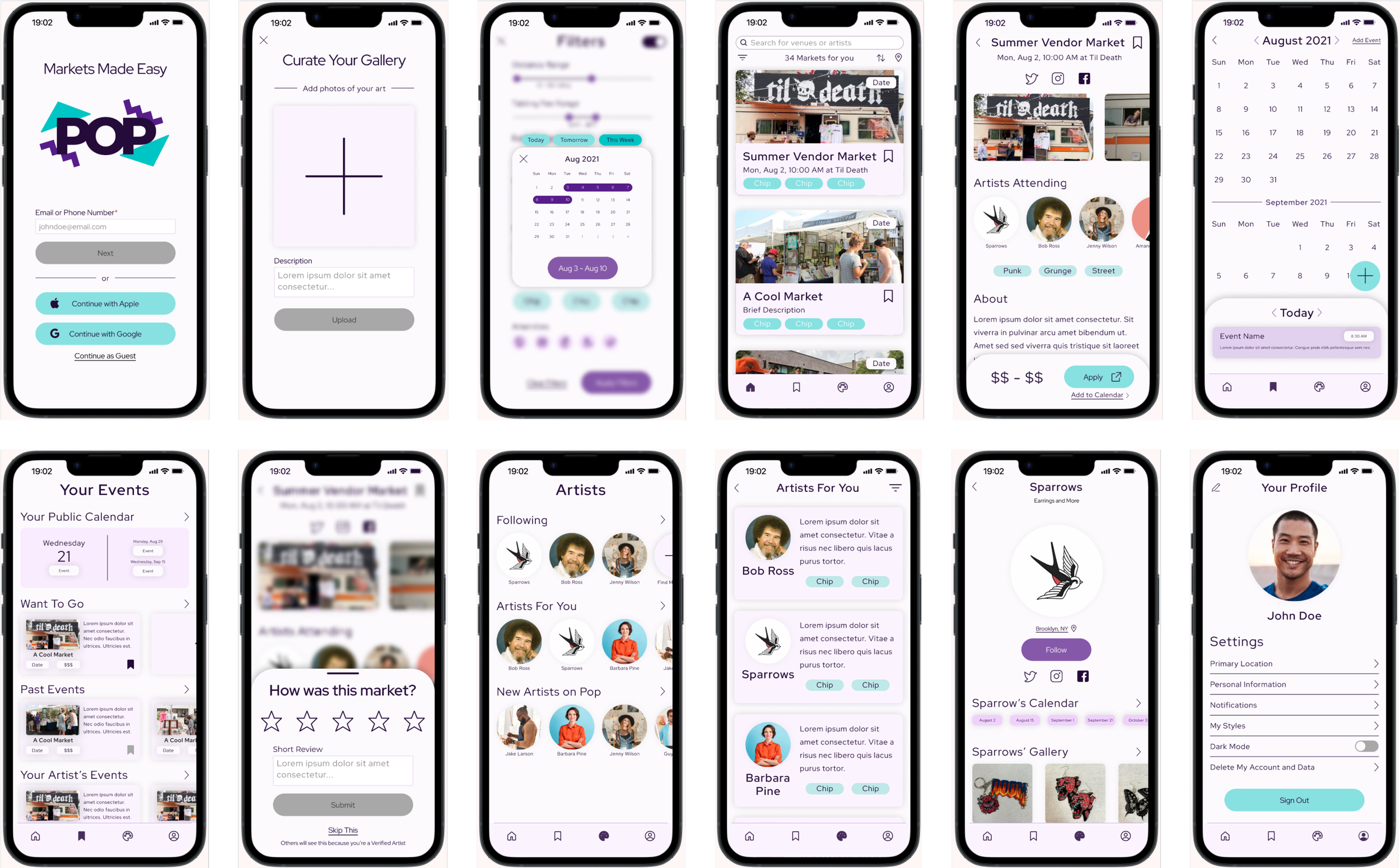
Final Screens
The last round of testing allowed me to iterate and create an intuitive and comprehensive final version of Pop Markets. Imbedded below are two Figma prototypes, one starting at the sign-up flow, allowing for exploration of both artist and attendee account types, as well as another prototype starting at the artist-end homepage.

Working on Pop Markets was an extremely rewarding and insightful experience. I had the opportunity to meet many interesting people within a niche in which I hadn’t had much knowledge or a comprehensive understanding of prior to this project. I faced more than a few challenges during my time with Pop, each one teaching me something valuable for future work.
Sourcing Research & Testing Participants
Because the art market scene in Brooklyn is such a small, niche community, it very quickly a difficult task to source participants. This challenge forced me to adopt my preconceived notions on sourcing potential participants. I had to go through the same flows as participants reported in order to find markets, which I believe further assisted in empathy-building. Once at the markets, I asked multiple vendors if they’d like to participate in the study.
Cutting it close to my set deadline, a couple interview participants dropped out, requiring me to scour for replacements. I again had to go through the flow of searching for more art markets taking place within the next day or two, which was difficult because of the infrequency of events. I was luckily able to find one within reasonable distance and successfully recruited replacements in time.