Resonance

Resonance is an online eLearning platform built to teach the basics of audio engineering. Resonance strives for accessibility for all individuals, with a focus on neurodivergence. A highly flexible and adaptable platform, Resonance works to be fully personalized and customizable based on user preferences, needs, and learning styles.
Sole Product Designer; user research, design, prototyping, end-to-end product design
My Role
Brooklyn, New York
Where
January 2022 - February 2023
Timeline
Figma, Useberry, UserTesting.com, Miro, Jira
Tools
The Problem
While there are many audio eLearning platforms and eLearning platforms in general, very few have a focus on neurodivergence accessibility. Those with neurodivergence often struggle with the standardized learning structure and have trouble finding alternatives that cater to their needs.
The Goal
Create an accessible, simplistic, and fun audio engineering eLearning platform that is both engaging, digestible, and educational for both neurodivergent and neurotypical users alike. We must be sure to be clear that we cater to neurodivergence without outright saying it, thus avoiding "othering" those with neurodivergent qualities
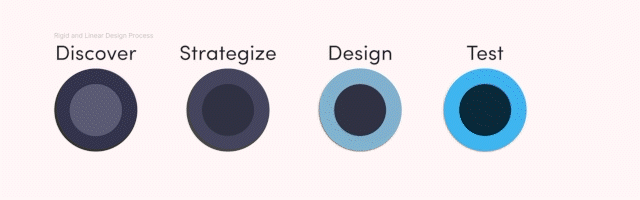
The Ideal Design Process


The Actual Design Process…
My true design process is imperfect and non-linear (and sometimes not centered, much like this GIF). While I go into every project with a formal linear design process in mind, the truth is that you will rarely follow that linear path. Roads close, there are detours, cancellations, tech malfunction, you name it. Design is never a straightforward process.
This case study, while I will do my best to keep things in logical order, will be an honest retelling of Resonance’s design process from start to end. There were many ups and downs during my time at Resonance, and this case study will thus reflect just that.

The first step was to create a research plan in order to outline and define my research goals. Within the plan is the objective, scope participant requirements, and research methods, which uncovered key qualitative and quantitative insights.
The interview questions went through many iterations, as I had a lot of trouble avoiding writing them in leading ways. I had many biases on neurodivergent education based on my own experiences, and it was difficult for me to look beyond them. Another problem I had to tackle was wording the questions in a way that wouldn’t “otherize,” or alienate my neurodivergent participants. The last thing I wanted to do was lead them to feel poked and prodded, tested like a lab rat — much like many of them have experienced enough of throughout their lives. Eventually I got them to a place where I felt ready to proceed with interviews, but only after my extensive secondary research, as I explain below.
Problem Space Definition
I had plenty of problems when working with Resonance, but no problem was greater than reforming my understanding of learning and education methodology. I was never the best student in school, as I have ADHD and traditional methods of learning just don’t seem to click with me. This is what attracted me so heavily to Resonance. I guess the mission statement resonated with me!
Because of my rough relationship with education, I had to form a foundational understanding of it from scratch — forget everything I knew about it. This may seem an obvious step standardized in research, however, it was difficult for me this time around for this particular problem space. To begin this journey, I performed some secondary research.
Academic Studies
I began by looking at studies focused on the outcomes of eLearning for students with specific neurodiversity (Autism, ADHD, etc.), followed by studies inquiring about people’s learning styles. The results, while somewhat aligning with my assumptions, did also contradict them, as I’ll explain below.

This research showed me the importance of hands-on learning overall, which I only expected for ADHD and Autism. However, for those with neurodiversity, almost all types benefit from some level of hands-on learning. And honestly, this totally tracks, as this has always been true for me. It can be tough for me to learn efficiently from reading or writing, I benefit much more from hands-on and experiential learning and this proved very challenging for me during this section of the project. Despite these challenges, I made it through!
With these insights in mind, I had to make some changes to my interview questions.
I changed the wording of some questions (e.g. “What type of structure helps you in a learning setting?” changed to “Is structure important to your learning process?” to better reflect the research and the question’s purpose, which was not to imply that they did in fact have a preferred structure, but if they did at all.), as well as adding a note to a few questions allowing the participant to skip if they’d like, or leaving it up to my judgment if I should even ask the question.
I finally felt confident in my changes and moved forward to my competitive analysis to further enhance my understanding of the problem space and refine my interview questions inquiring about competitors.
Competitive Analysis
After completing the academic research, I dove into competitive analysis using said research as a sort of guide. I now understood what to focus on and what qualities to look for.
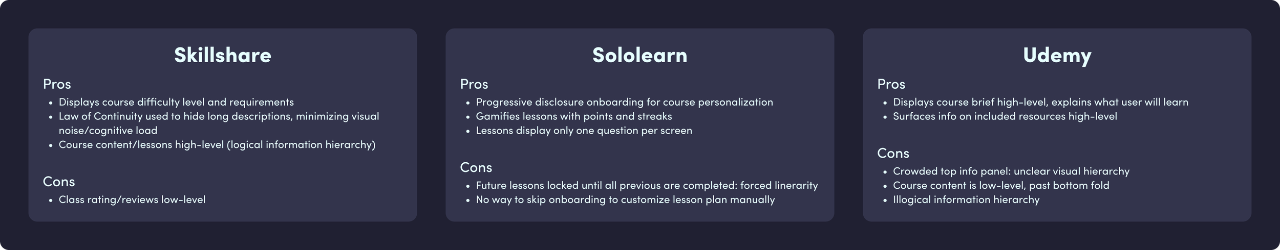
My final choices were Udemy, Skillshare, and Sololearn. Udemy was added in after user interviews, as many participants reported using and enjoying the platform. Some others in the running included Duolingo and Coursera, though I felt the insights observed were repetitive and redundant to include.
Udemy and Skillshare were chosen for their variety of available courses and vast information. I wanted to understand how they handled the organization of information. Sololearn was selected for its simplicity and minimalist design. I liked how they condensed information and lessons and I wanted to discover any cons present in their design.
User Interviews & Surveys
What I Tried
With my now refined research plan, I began the task of gathering participants. The struggle here was sourcing neurodivergent participants without otherizing them and making them feel categorized. I didn’t simply just want to post on Reddit asking with a post title of “Neurodivergents wanted, plz DM me!!!” I did attempt something like this (with a real post title), but it yielded poor results. I felt many of the people reaching out were lying about their neurodivergence, but I had no way of confirming this, so, back to the drawing (Miro) board!
What Actually Worked
I instead made postings online that said I was looking for people that struggled in school settings. I then only proceeded with the people that opened up or hinted towards their neurodivergence in their comments expressing interest (e.g. “Hey! I’d love to participate in this study. I have ADHD and this really got in the way for me.”).
I also made postings that stated I was looking for students in general who have experience using my competitors stated above, with the hope that I could attract participants from all walks of life, which was successful I assume due to the generality.
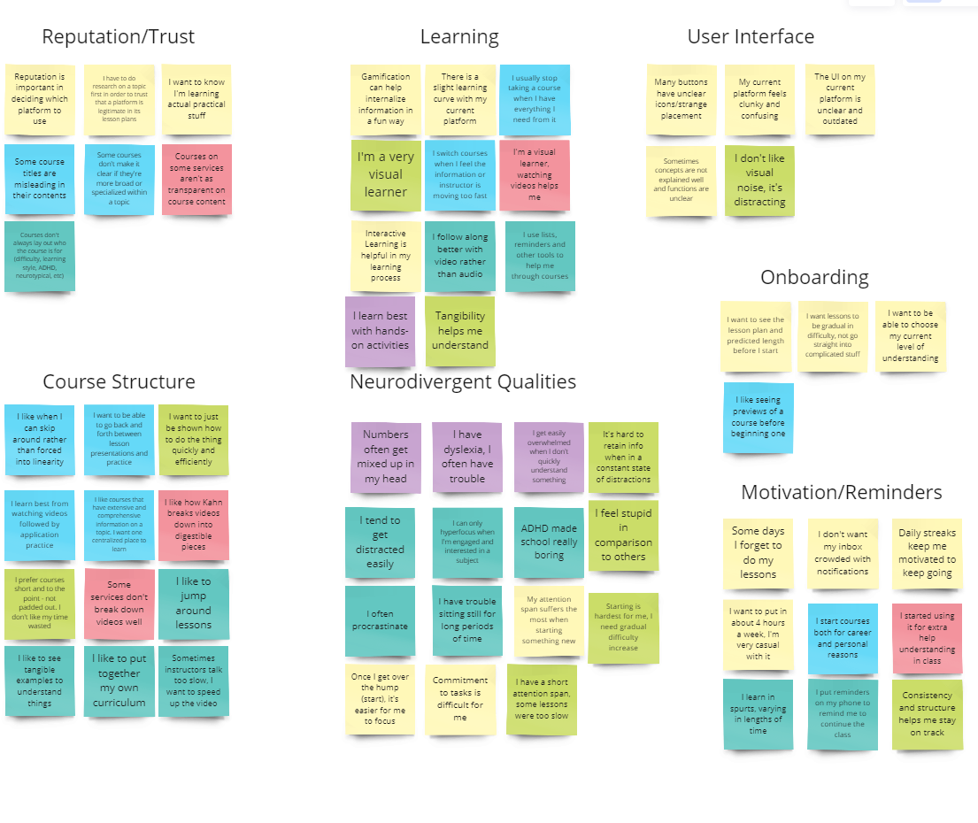
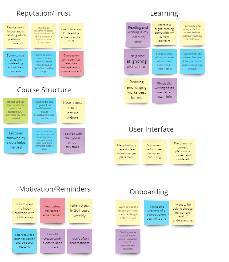
I took my findings and sorted two affinity maps: one for neurodivergent users and one for neurotypical users.
Neurodivergent Results
Neurotypical Results
Empathy Maps & Personas
From the boring affinity maps above, I combined both into their own little (still boring) empathy maps! Look, I know this is boring and repetitive, but trust me, it gets more interesting later on when I lose all my files… Oops, spoilers.
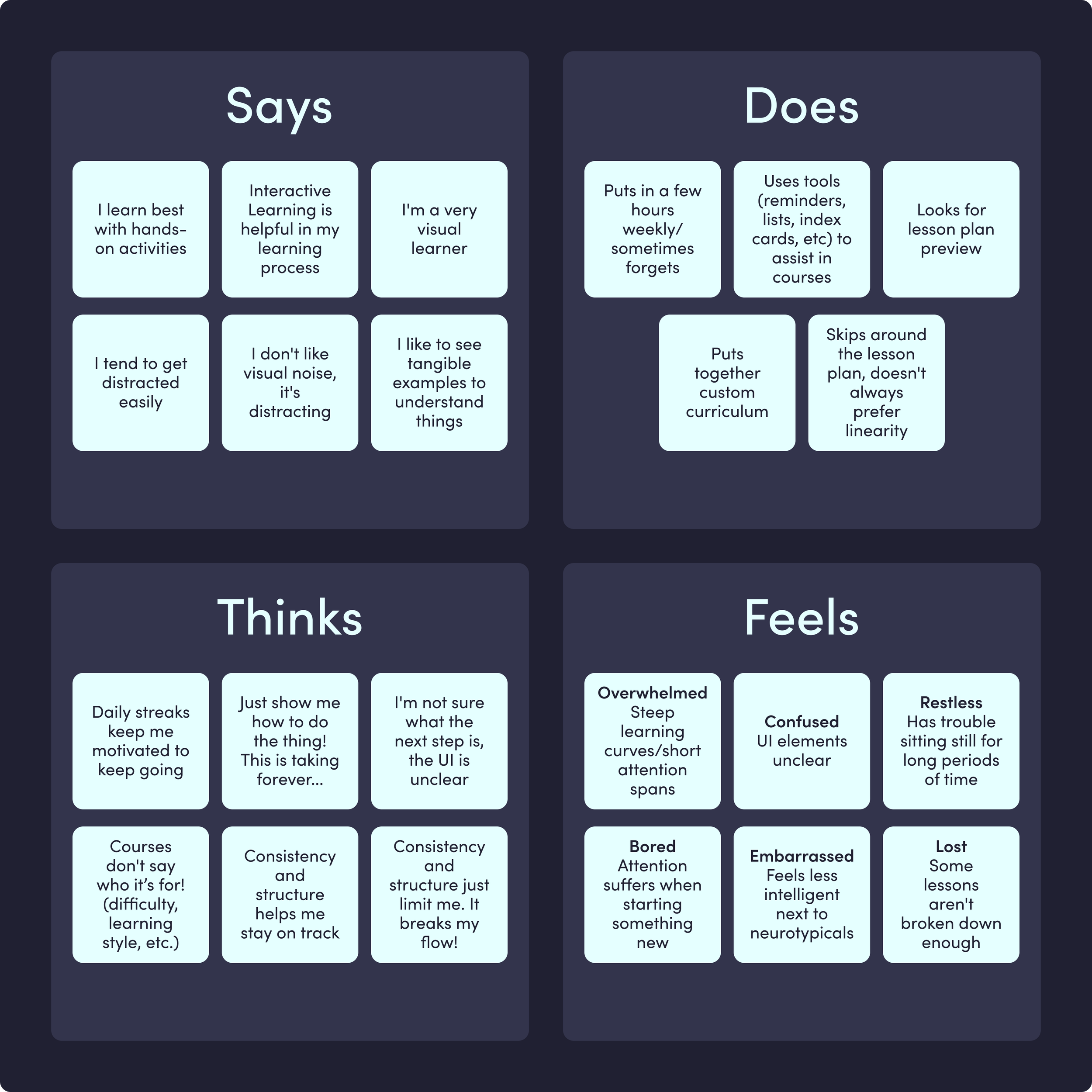
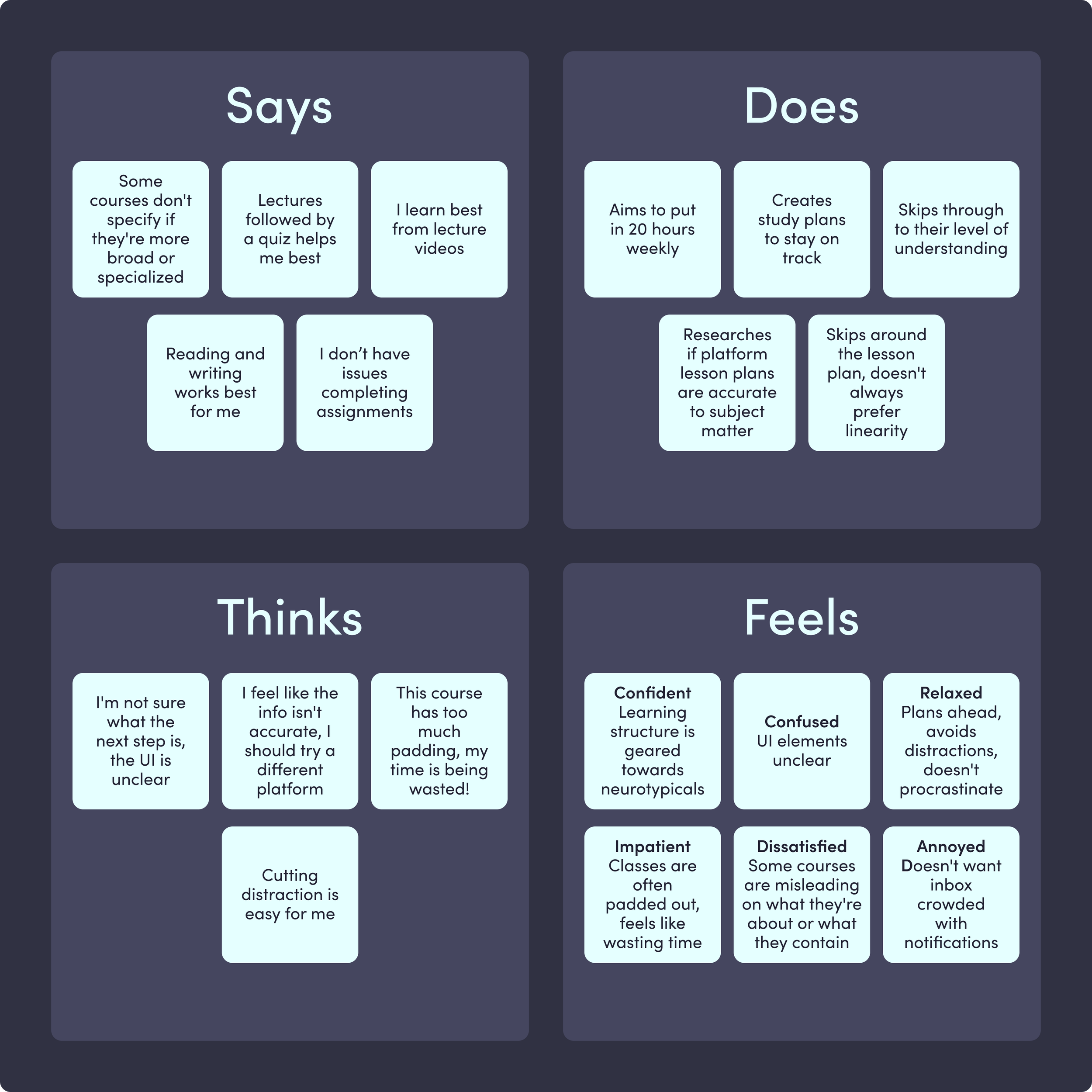
Anyway, in order to organize and visualize user issues and pain points, I again, put together two empathy maps: one for neurodivergent users and one for neurotypical users.
Neurodivergent Empathy Map
Granular Synthesis
One of the most important changes to the neurodivergent persona was in his personality section. Finding the balance for, say, Attention Span between all types of neurodiversity observed in participants was difficult. For example, those with ADHD report having very low attention spans, but those with dyslexia exhibit slight issues in attention but with a focus on visual attention. So boiling it down to a number from 1 - 10 felt very reductive and incomprehensible.
I found that in early discussions with the developers, some of them seemed to fixate on the number given to an attribute (e.g. Attention Span: 4/10). My solution to this was to replace the number system with 5 radio icons (e.g. Attention Span: ●●●○○) with the hope that essentially removing the number value would be looked over. But of course, as developers love their numbers, they boiled it back down to new numbers: 1 - 5. I decided to switch to a bar with nothing to number or count.
While confident this would solve the issues, I worried that this would cause them to ignore the personality section altogether due to the ambiguity of a bar. To remedy this I added an extra deliverable document linked to the personas that would define each trait attribute to assist in giving context to their meaning. Click here to view the sheet. This required a bit more reading academic studies to determine the best way to describe each. This research also resulted in more variations to how much to put into each bar. This seemed to work best. It really goes to show that every detail matters, no matter how small; it all makes a difference!
User Journey Maps
Neurotypical Empathy Map
Using the empathy maps, I created their two respective personas to go with them. I had to be thorough here because while one of our developers was neurodivergent (he has ASD), the other two are neurotypical. I needed to be sure to be broad but specific to ensure everybody involved could empathize efficiently. The neurotypical persona stayed relatively the same throughout the project sans some wording, but the neurodivergent persona had to go through many iterations due to misunderstandings of user needs.
I believe this was due to the generalization of the neurodivergent persona. Had I had more time, I would have liked to make individual personas for each type of neurodivergent user (ADHD, ASD, Dyslexia, OCD), but due to restraints I decided that making a comprehensive general persona would work best.
Neurodivergent Persona

Neurotypical Persona
To assist in understanding motivations and paths users take even further, both neurodivergent and neurotypical, I put together a journey map. Before beginning at Resonance, I had very little experience using eLearning platforms, so I was unfamiliar with the flows, as were many of the stakeholders.
Putting this together was a compromise with developers as around this time, I was told the timeframe was to be shortened. I essentially lost a month off the timeline. My compromise was combining the neurodivergent and neurotypical personas into a single journey, focusing from how a user makes the choice of which platform to use, to their preferences once starting a course. Had I had more time, I would have preferred to make a journey map for both.
Using the most valuable parts of each persona and empathy map, this is what I put together.

From comparative analysis to user journeys, the discover phase helped me easily immerse myself within the problem space, opening my eyes to many potential solution opportunities, as well as a few pitfalls to avoid. All of these exercises assisted in further empathy-building with our users, leaving me with a few valuable insights:
Both personas prefer community-oriented spaces
Both personas need artist & art style/genre information high-level
Users need to reach desired destinations within 3 steps in order to lower cognitive load

LeanUX, Insight/Need/Brainstorm, & Prioritization Matrix
Information Architecture

Using the insights retrieved in the discovery phase, I wanted to transform these into actionable items. To get started I worked with a LeanUX matrix to begin problem solving and focus on optimizing business outcomes. This portion uses many assumptions of outcome, however, it often is a useful tool to help communicate with stakeholders my reasoning and plan to benefit the business.
The strategize phase did much work assisting me in organizing my thoughts and ideas, mapping them out logistically and holistically. These exercises resulted in the ideation and creation of many features which made it into the final design.

Sketching
Mid-Fidelity Wireframes
Mid-Fi Usability Testing
Once I was happy with my basic screen sketches, I began designing mid-fidelity wireframes and prototypes. After prototyping, I designed a few usability tests for each end of the app using Useberry and sent them out to select participants who passed my screener.
Findings
Users often were confused by unclear iconography
Users would often have trouble finding “save event” button, increasing bounce rate
Artists had trouble finding their calendar
Artist participants expressed a desire to add descriptions to gallery images
Users expressed a desire for a method of increasing trust in venues
Solutions
Updated iconography to better reflect purpose and conventions
Add a save feature to Posters themselves as well as a first time tooltip on market pages
Add microcopy “Your Calendar” above calendar
Add affordance of adding an image description as well as a way to edit later
Add an affordance for verified artists to be able to submit public ratings and reviews post-event
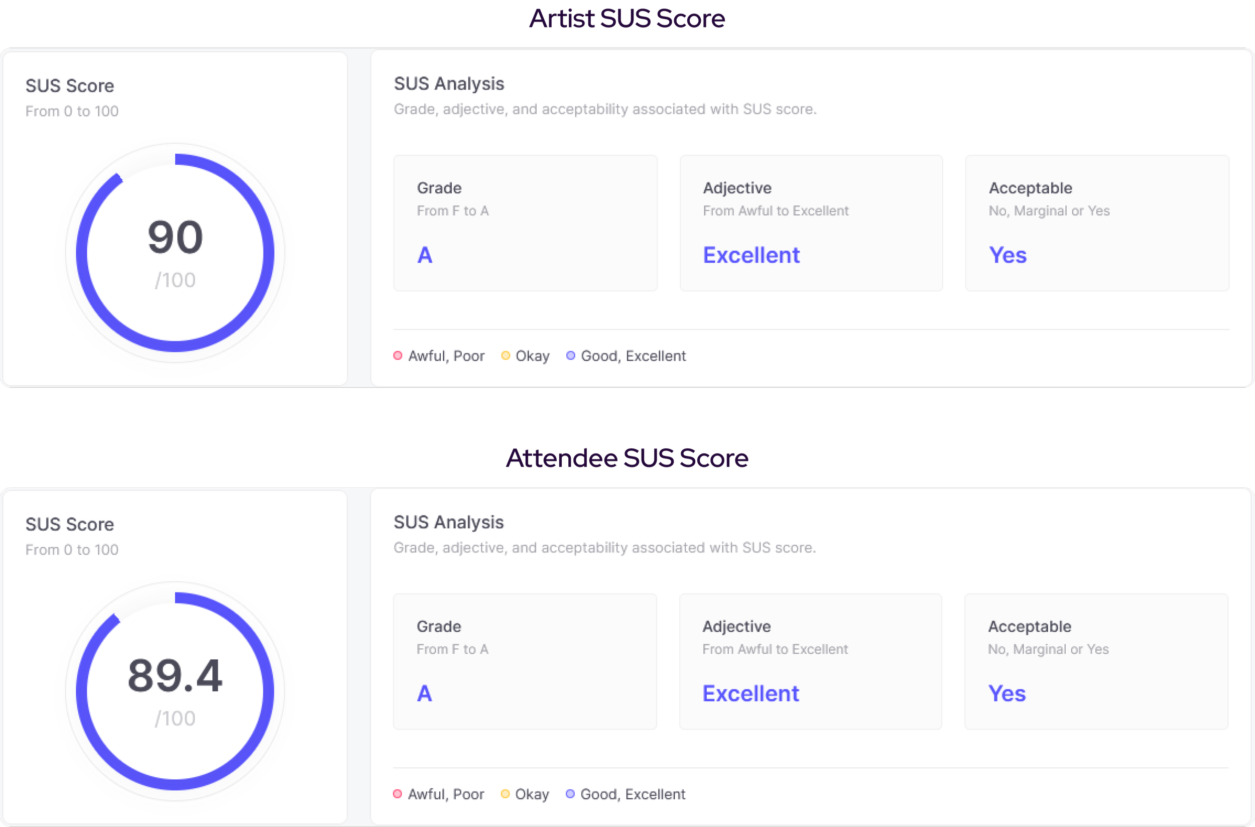
With an average time-on-task at 28.6 seconds, a 100% completion rate, and a SUS score 90 for artists and of an average time-on-task at 29.7 seconds, an 89% completion rate, and a SUS score of 89.4 for attendees, I felt I had everything I needed to move on to the next step in my process.
UI Design

The design phase allowed me to further explore my ideas and workflows in a visual and more tangible way. I was able to identify points of friction which resulted in tweaking and iteration to create optimized user flows. Testing revealed the ways in which Pop’s target users think through certain flows, which informed even further iteration on design decisions. I was also able to use what I learned about how users interpret Pop’s hierarchy to begin work on Pop’s design system, Medium Design.

Hi-Fidelity Mockups
Hi-Fi Usability Testing
For my second round of testing, I created similar unmoderated usability tests focusing on some of the same flows as well as some new ones. From 81 attendee participants, and 27 artists, I was able to gather many new insights I may have overlooked before.
Findings
Users were still having trouble reaching certain destinations to do unclear microcopy
Users often would swipe left and right with the assumption that it would move through pages
Artists would often go to their profiles to add events to their calendars
Artists would often have trouble finding “Add to Calendar” CTA on market page post-application
Solutions
Updated microcopy labels to better reflect elements’ purpose
Added the affordance of left and right swiping to go back and forth between pages
Added multiple additional workflow paths for artists to add calendar events
Changed link CTA bellow Apply CTA to responsive button (button would change microcopy from “Apply” to “Add to Calendar” post-application

Users averaged a time-on-task at 41.6 seconds with a 100% competion rate, and a SUS score of 92.8. This phase of testing revealed a few flaws with the design as well as proving many design decisions as efficient and aligned with principles. These insights allowed for further iteration, resulting in the final screens of Pop Markets.
Final Screens

Working on Pop Markets was an extremely rewarding and insightful experience. I had the opportunity to meet many interesting people within a niche in which I hadn’t had much knowledge or a comprehensive understanding of prior to this project. I faced more than a few challenges during my time with Pop, each one teaching me something valuable for future work.
Sourcing Research & Testing Participants
Because the art market scene in Brooklyn is such a small, niche community, it very quickly a difficult task to source participants. This challenge forced me to adopt my preconceived notions on sourcing potential participants. I had to go through the same flows as participants reported in order to find markets, which I believe further assisted in empathy-building. Once at the markets, I asked multiple vendors if they’d like to participate in the study.
Cutting it close to my set deadline, a couple interview participants dropped out, requiring me to scour for replacements. I again had to go through the flow of searching for more art markets taking place within the next day or two, which was difficult because of the infrequency of events. I was luckily able to find one within reasonable distance and successfully recruited replacements in time.